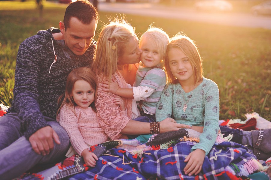

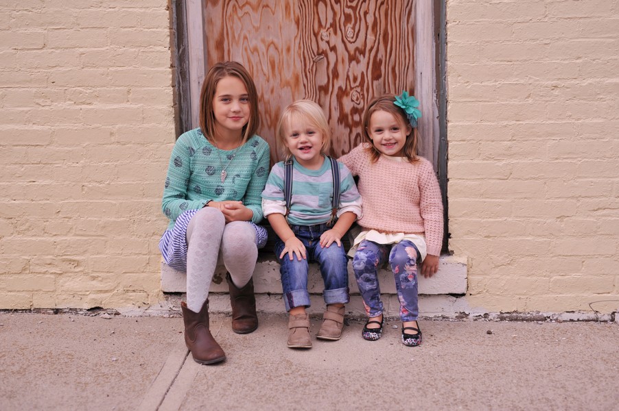
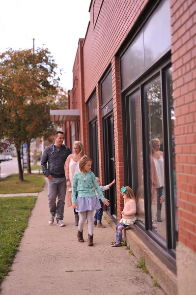
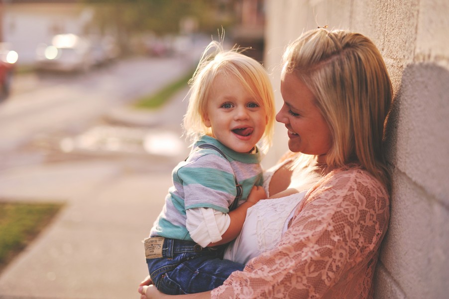
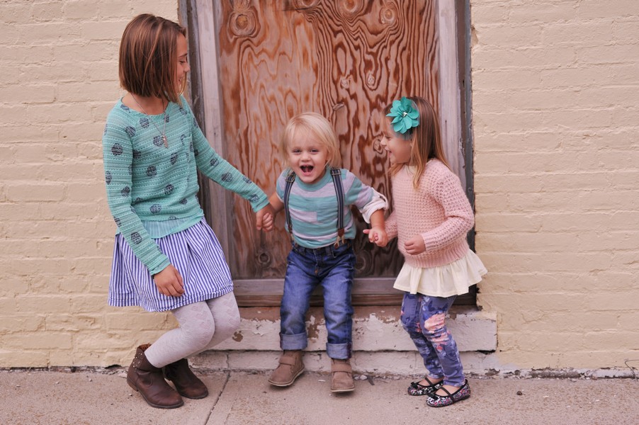
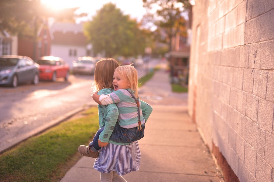
You’ve heard it before, but I’ll say it again…You want your wardrobe to coordinate, not match. Here, I chose a color scheme of blush, mint and navy. Having at least three colors to work with will give you more flexibility when it comes to dressing your family for a shoot. Add prints and textures to make the wardrobe more playful and less uniform.
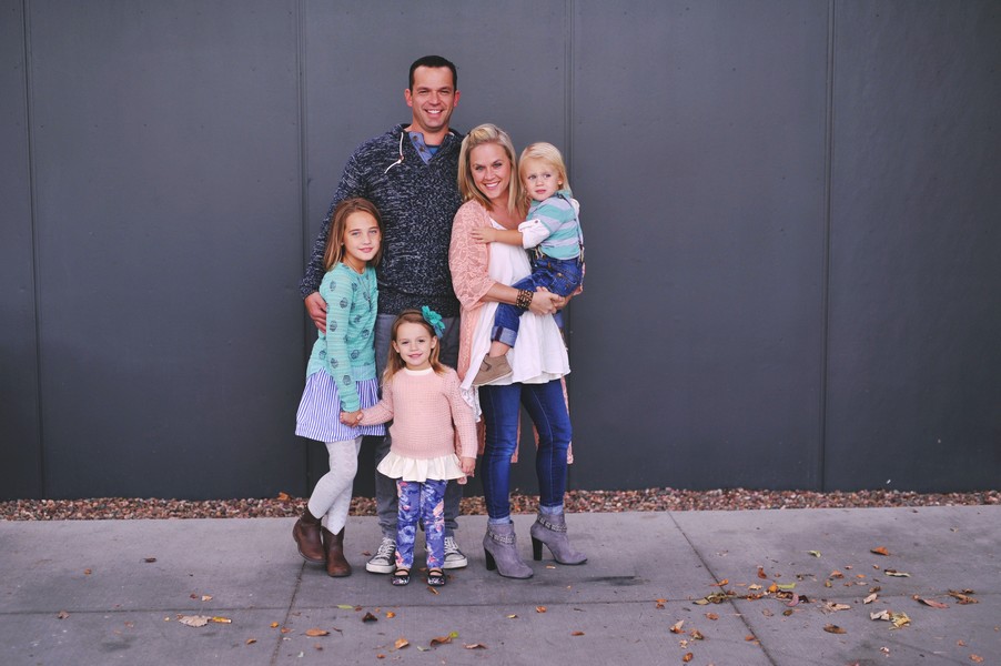
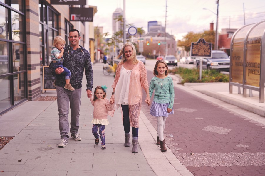
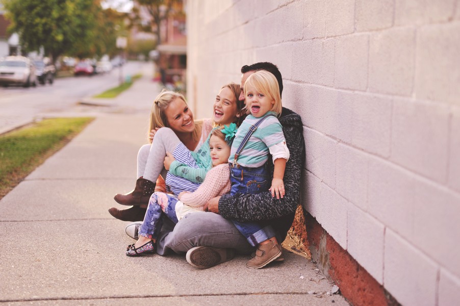
Lots of layers and prints gives the photo more depth and makes each outfit look polished and complete! Plus, it will allow you to showcase the personalities of each family member. These styles can be found at GapKids, Target, H&M and Spool72.

Photos by Sarah-Beth Photography//sarah-bethphoto.com
Styling by Heather Kiesel//sbp styling

Leave a comment